Here is a tutorial of how to organize all of your clips in the bar of premiere pro. In order to get a neat clip bar, you can use bins to store your clips. The bin icon is located in the lower left corner and looks like so:
Click on that and a new folder should appear among your clips.
Go on and title this folder, I had a lot of text slides in this particular video so that was the first one I created.
Next, just click and drag clips into that folder.
Then you can continue and make more folders for the other clips you have like the bloopers one I made below.
Once you have placed all the clips you needed into folders, you are good to go! Now your clips are neat, in folders, and easy to find.
Now, next time you start a new project and need some order, use this tutorial to keep some organization during your project!
This past week I have been working on this interview for the ONW 1 in 2000 project. I interviewed Amanda Campbell who is a sophomore here at Northwest. She shared with me about the camp she went to over the summer which was a KU design camp where she explored similar e-communication strands. She got to work with both video animation projects which furthered her knowledge of those areas. She got to help design jerseys and different animations. I discovered that she is very serious about this area of video production and she want to have a career in her future doing something with video.
This was the first video in a long time that I have had to record a voiceover, and I really enjoyed it because it added to the video and made it feel more professional. I liked adding a voiceover because it gave me a taste of what it would be like to work in convergence and work with ONW Now which I am very interested in doing.
one shot
I enjoyed filming this video more than the other because I really only needed one shot at the least and it was very simple and pulled together so I liked that. I liked having minimal shots because it let the viewer really focus on what she was saying and what she had to share with us and I think that is important.
I like that my finished video is very simple and clean cut. I like that it tells the story and really conveys what the camp is and how much she enjoyed this camp. I'm really proud of this video because it kind of dips my toes in the water of what I want to create when I work with ONW Now.
For the past week and a half, I have been working on some Photoshop tutorials that have helped strengthen and expand my knowledge of Photoshop. I have learned many new things including how to built a portrait collage, how to remove logos on t-shirts, and how to build a product ad. Before these tutorials, I would have had no idea how to do any of this editing.
Tutorial 1
The first tutorial started me out pretty simple. I used the marquee tool to edit out part of the background in the picture of the model in the green to smooth out the backdrop. In the photo of the man against the wall, I used the lasso tool to remove the blemishes form the wall to create a better background.
Next, I advanced onto logo removal, in which I removed the logo from this man's surfboard
Or using another technique, I simply moved his logo on the surf board in case he still wanted it.
Tutorial 2
In this next tutorial, I was introduced to using the patch tool to edit out graphics on t-shirts. In the photo, the father's shirt had a graphic that the photographer was not too fond of, so I used the lasso tool and patch tool to remove the graphic
Tutorial 3
In this next tutorial, I again used the clone stamp tool to remove a tag form the model's coat. This tool draws color from another area of the coat, and then uses it to cover up where you need it to. This helped give the photo a cleaner and more finished look.
Tutorial 4
Continuing on, I got to use some tools I was not really used to using. The clone stamp tool is a pretty handy and important tool, because it lets you take a sample of color from another area like the one you are fixing, and use that to edit the area you want. I used this tool a lot in the picture below, where I edited out the building above the man's head.
Tutorial 5
In this next tutorial, I used the patch tool to help clean up the freckles and blemishes on the boy's face to make the picture a little cleaner and more precise.
Tutorial 6
In tutorial 6, I got to built a portrait collage. I started out with three individual photos and ended up with one composite. There were several steps to creating this including having to stretch the background, edit in shoulders for the center photo from another picture, and blend out the background to get rid of the trees.
Tutorial 7
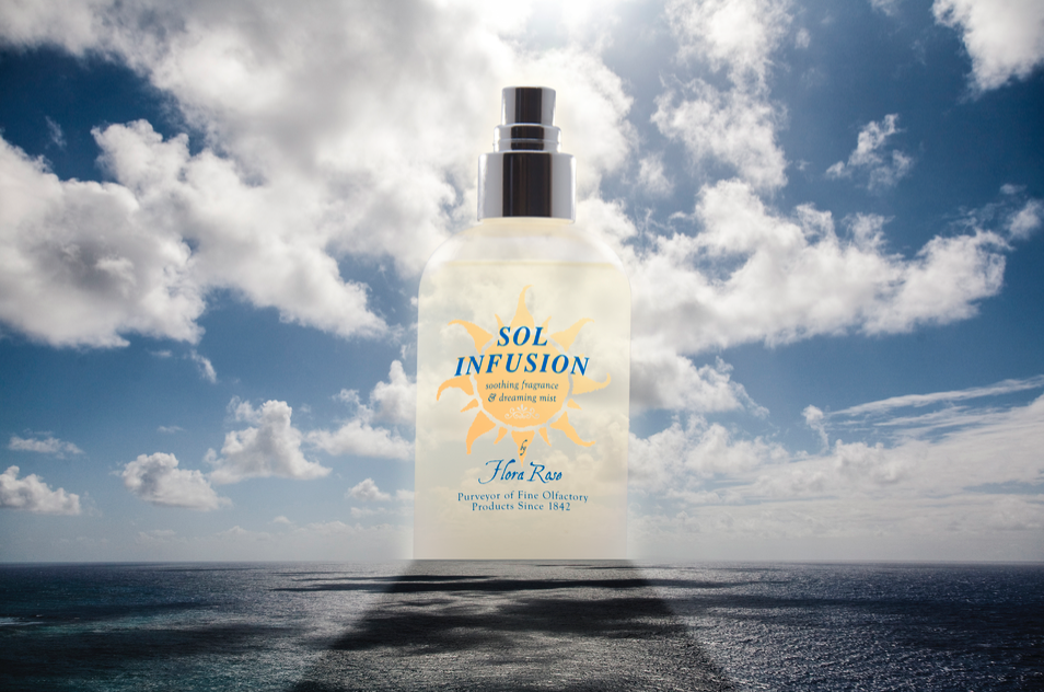
In this tutorial I got to make a product ad type photo. I started out by adding the logo onto the bottle and slightly bending it to look more natural. Then I placed it behind the horizon line, gave it a glow, and faded it to flow with the setting.
Tutorial 8
In this last tutorial, I worked with a McDonald's billboard. The actual billboard itself and the ad started out as separate pieces, but then I combined them and then scaled the ad down to fit the board. Then I rounded the edged and bend it slightly to look more realistic.
Overall
I really enjoyed doing these tutorials, they taught me a lot I did not even know before. Three important tools I learned were the clone stamp tool, the patch tool, and the quick selection tool because they are good foundation tools. These will be helpful in the future because I will be using them a lot and they will make my project look clean and neat.
My strengths were I was good at following the tutorial and I could pick the stuff up pretty easily. One thing I need to work on is organization of my layers and masks and everything because that is really important. One skill I learned was time management and how that effects meeting deadlines, because I had to work really hard to get these done.
Overall, I really enjoyed getting to know Photoshop and this was a good project to start the school year.
This last week and a half, I have been working on a video about an ONW procedure. The video wwe were supposed to create was one about a procedure that we as students are supposed to follow. Right off the bat I knew I wanted to create a video that was different from everyone else', so my partner and I though of how we are supposed to walk in the halls.
During story boarding, my partner and I came up with a few concepts of how we wanted our video to turn out. We decided on two ideas, do not stop in the hallways and do not walk slow. During the editing process, I went with the first idea because it fit within our 30 second restraint. While we were filming, we tried to get as many shots as we could, and tried to get more faces in our video.
Since this was our video project of the year, I had to get back into the groove of deadlines and production. Along with this new year, we started using a new video editing program, Premiere Pro, which was difficult because I was totally unfamiliar with it, and I am still exploring it. I also learned how to work with difficulties, because during the first two days of filming, we had limited equipment, so I had to learn how to work through that in order to meet the deadline.
What I would do different is spend a little more time mapping out shots, because by the time we got to editing, I realized we really need more shots and closeups in order to complete the video and give it a beginning, middle, and end. One thing I really liked while creating this video was editing, I loved working with the colors and the text overlay. Next video, I will make sure to map out what I want the final video to look like while story boarding.
Overall, I really enjoyed making this video and I think it was a good starter project for the rest of the year. I am excited to see what else I will learn and create.
My group's product was Spray On Clothes and our team name was ELLO. We worked together pretty well, we all knew what we had to do ad we did each of our own parts. We struggled a bit with communication and overall team encouragement. For the next product, I will make sure there is an established leader and that everyone trusts their team. I would have made our script a little bit longer, and maybe have done something different with the commercial, but we did the best we could. I have improved by stepping up and being a leader and directing people to what they need to do.
This quarter, I designed the logo as seen below.
I also directed the shots for our video, which you can see some screenshots below.
Overall this was a very good experience with product design and presentation, and also working with people you may not normally work with.
In graphic design, we had to develop our own logo that represented who we are and what our business means and represents. In this first logo, I drew from Twenty One Pilots logo with the slash through the "O". This design is very simple and to the point, which is what I would like my business model to be like.
It also shows, with the font, the creativity I would bring.
This logo was a favorite of my peers. This shows my fresh
and lighthearted side with the colors.
the color are simple but bring a good feeling.
Normally logos have the circle around them, so
I used my circle to represent the "O" in my name.
This is my last logo and this was also very well liked. My last name is Markey, so I wordplayed on it to make this logo like a marquee. The text is an older, Broadway feel, for I really enjoy vintage 1950's era. This logo gives a comfortable feeling, yet a vintage and eccentric mood.
In our last days before spring break, we experimented with Photoshop and created these images. I got to use very different tools I had not used before, like on this one I used the clone tool that created the fluttering effect on the butterfly's wings.
In this photo, I used a few different images and faded them then placed them on top of each other.
This photo's procedure was much like he last ones, except I actually cut the raven's head from another photo and placed it on top of the one of the school.
In this one I used the gradient tool that I hadn't used before, and that created the blue and black hue outside the letters.
Overall, I learned more about Photoshop and I am much more comfortable with the program.




 This logo was a favorite of my peers. This shows my fresh


